Admin Settings: Theme & Palette
The Theme & Palette section controls the shared Authica admin interface appearance.
These settings use Authica’s shared UI Core token system, so changes apply across Authica admin pages that use the shared UI Core design system. This helps keep cards, buttons, tabs, controls, tables, and other interface elements visually consistent.
Automatic Light/Dark Mode
The Automatic Light/Dark Mode option controls whether Authica should automatically choose the interface theme based on the user’s system or browser preference.
When enabled, Authica can switch between light and dark presentation automatically.
When disabled, Authica uses the manually selected Theme Mode setting.
Use this option if you want Authica’s admin UI to follow the device or browser appearance preference.
Theme Mode
The Theme Mode setting controls whether Authica admin pages use a light or dark interface.
Available modes may include:
Light
Dark
Use Light for a brighter admin interface.
Use Dark for a darker, lower-glare admin interface.
If Automatic Light/Dark Mode is enabled, the manual Theme Mode setting may be overridden by the automatic preference.
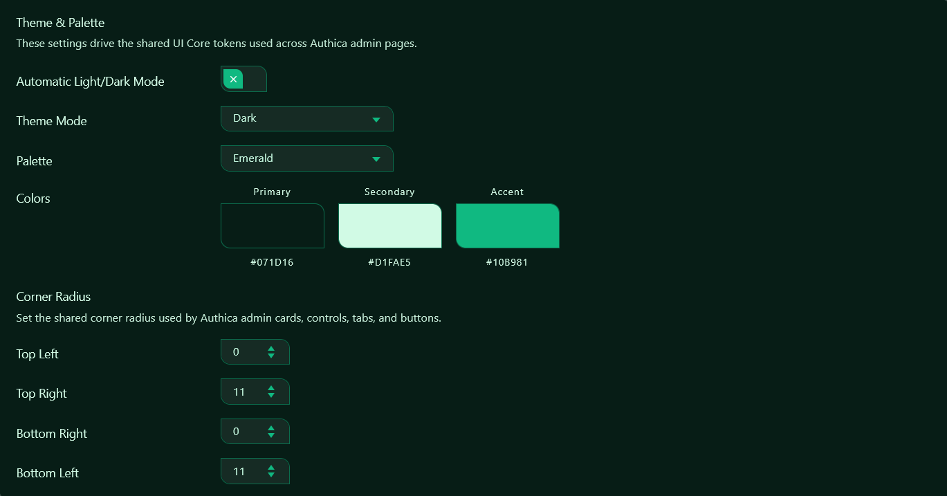
Palette
The Palette setting controls the main color set used by Authica’s shared UI Core.
A palette defines the primary, secondary, and accent colors used across Authica admin screens.
For example, the Emerald palette uses a green-based design style for backgrounds, text highlights, controls, buttons, and active states.
Changing the palette updates the overall visual identity of Authica admin pages without requiring custom CSS.
Colors
The Colors preview shows the active palette values.
The preview includes:
Primary
Secondary
Accent
Primary
The Primary color is usually used for the main background or dominant UI surface.
Secondary
The Secondary color is usually used for readable contrast, text accents, softer surfaces, or supporting interface colors.
Accent
The Accent color is used for active controls, selected tabs, primary buttons, highlights, and important interface actions.
The color values shown below each swatch help identify the exact palette colors currently in use.
Corner Radius
The Corner Radius settings control the shared border radius used across Authica admin UI elements.
These values affect the shape of shared interface components such as:
Cards
Buttons
Tabs
Input fields
Dropdowns
Number boxes
Tables
Control shells
Authica supports independent radius values for each corner.
Top Left
Controls the top-left corner radius of shared UI elements.
A lower value creates a sharper corner. A higher value creates a more rounded corner.
Top Right
Controls the top-right corner radius of shared UI elements.
This can be adjusted independently to create a more custom Authica interface style.
Bottom Right
Controls the bottom-right corner radius of shared UI elements.
Bottom Left
Controls the bottom-left corner radius of shared UI elements.
Asymmetrical Corners
Because each corner can be configured separately, Authica can create asymmetrical interface shapes.
For example:
Top Left: 0
Top Right: 11
Bottom Right: 0
Bottom Left: 11
This creates sharper left-to-right diagonal styling where some corners are square and others are rounded.
Use matching values on all four corners if you prefer a fully consistent rounded style.
Recommended Usage
For most sites, choose one theme mode and one palette that matches your preferred admin style.
A good default setup is:
Automatic Light/Dark Mode: Disabled
Theme Mode: Dark
Palette: Emerald
Corner Radius: 0 / 11 / 0 / 11
Use smaller corner radius values for a sharper, technical interface.
Use larger corner radius values for a softer, more modern interface.
Saving Changes
After changing theme, palette, or corner radius settings, click Save Changes if available on the page.
Some Authica admin appearance settings may update visually right away, but saving ensures the selected settings are stored and reused across Authica admin pages.
Important Notes
These settings affect Authica admin pages, not the public WordPress login form.
To customize the public login page appearance, use:
Authica → Appearance
or the Authica login form Customizer controls.
The Admin Settings page is for Authica’s internal admin UI style, shared controls, and UI Core appearance.